
My AI position sizer lost to a shuffled placebo, and six more smart ideas died with it
A lineage of eight studies that tried to make risk management smarter: machine learning, reinforcement learning, safe-haven hedges, trend-quality filters, level-strength sizing, correlation overlays and path efficiency. Almost every one of them lost to the simple version, and the reasons why form a pattern.
A reinforcement learner studied my trading system’s history and carefully learned how much leverage to use in each market state. Its result: +0.72% per month. Then I took its learned rules, shuffled them into deliberate nonsense, and ran the test again: +1.57% per month. The intelligence was worth less than nothing.
That experiment sits in the middle of a longer story. Over eight studies I tried to make my risk management smarter: machine learning to predict danger, reinforcement learning to pick leverage, a crisis hedge for crashes, quality filters for trends, bigger bets at stronger price levels, a correlation monitor for my currency pairs. Nearly all of it failed. What survived is the dumbest tool in the box, a rule that watches the account balance and halves the position size when things go badly. This article walks through the whole lineage and ends with why simple kept winning.
First time here? What you need to know
This blog is a verification diary. I (one person) build my own automated FX trading program (an EA), statistically test trading methods, and publish everything, wins and losses alike. “Study N” refers to my numbered research log. The tests run on about 11 years of real data across FX pairs, gold, silver and stock indices.
Four terms before we start. PF (profit factor) is gross profit divided by gross loss; above 1 means profitable. DD (drawdown) is how far the account falls below its running peak, the depth of the valley. An overlay is a layer that sits on top of the trading logic and only adjusts position size, without touching entries or exits. And vol-target means scaling lot size to recent realized volatility, the workhorse overlay in my system.
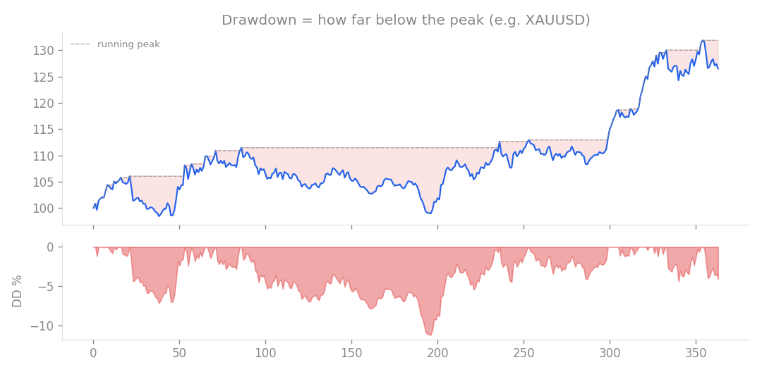
Drawdown, the thing every study in this article was trying to shrink cleverly.
The starting point: halve the size when the equity curve sags (study 26)
The lineage begins with something almost embarrassingly simple. When the account’s equity curve drops below its own 60-day moving average, cut position size in half. This classic equity overlay amounts to “ease off when you are cold.”
I ran it on an H1 trend-following core covering gold and four yen crosses (XAUUSD, USDJPY, GBPJPY, EURJPY, CHFJPY) at 0.4% risk per trade.
| Metric | No filter | With overlay |
|---|---|---|
| Max drawdown | -17.4% | -15.2% |
| Monthly return | 0.99% | 0.76% |
| PF | 1.35 | 1.28 |
The drawdown got about 13% shallower, and the return shrank roughly in proportion. The moving average lags, so the throttle stays on into the recovery phase, exactly when the system should be earning its way back. Raising risk to 0.6% only brought 1.07% per month at a -22% drawdown. A Monte Carlo test against prop-firm rules (resampling daily returns to estimate the pass probability) put that aggressive setting at 77% for step 1 and 62% overall, with a 22% chance of failing on the maximum-loss rule.
So the overlay is not magic. It is an honest trade: you hand over return and receive drawdown relief at a fair price. The study also drew the map for everything after it: roughly 0.5% per month if you keep drawdown under 10%, roughly 1% if you accept around 15%, all of it regime dependent.
Naturally the next thought is: surely something smarter can beat that exchange rate. I spent seven studies finding out.
Machine learning predicts the risk (study 100)
First, machine learning. Instead of predicting price direction, I trained LightGBM to predict risk: given recent volatility, momentum, drawdown state and the distance from the US500 index, forecast the next 20 days of volatility and adjust leverage accordingly.
The first run, on 2019 to 2025 data, produced 3.12% per month at a 10% drawdown. That was 2.7 times my baseline of vol-target plus a stock-market filter (1.16% per month). It looked brilliant, which is precisely when a result deserves suspicion.
Extending the test window back to 2018 cut the return to 1.64%. Then came the placebo test: shuffle the model’s predictions so they carry zero information but keep the same leverage distribution, and run it again.
| Version | Monthly return |
|---|---|
| ML predictions driving leverage | 1.64% |
| Placebo (shuffled predictions) | 1.44% |
| True contribution of the predictions | 0.20% |
Almost the entire apparent edge was a byproduct of merely having that leverage distribution. The forecasts themselves added 0.20% per month, noise territory. The root cause is worth remembering: in a trend-following system, trailing volatility already predicts forward volatility about as well as anything can. The model had nothing left to learn.
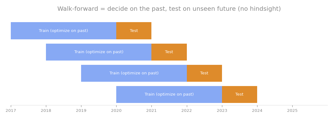
Both ML studies used walk-forward testing to prevent hindsight. That alone was not enough; without the placebo comparison, I would have shipped an illusion.
Reinforcement learning picks the leverage (study 105)
Taking the lesson to heart, I tried a much more constrained learner: a tabular contextual bandit. The market state was reduced to three coordinates (volatility tercile, stock filter on or off, drawdown status), and for each state the model had to choose leverage from just 0.5, 1.0 or 1.5, learning walk-forward.
You saw the headline numbers already. Here they are side by side.
| Approach | Monthly return | PF |
|---|---|---|
| Contextual bandit (RL) | +0.72% | 1.15 |
| Placebo (state-to-leverage shuffled) | +1.57% | 1.32 |
The learner, punished hard for drawdowns during training, collapsed into a degenerate policy that chose 0.5 leverage almost everywhere. And the shuffled version, the one with its learned mapping destroyed on purpose, beat it on both return and PF. Whatever the model had learned, it was not market structure.
Could a cleverer reward function fix it? Probably it would change the numbers, but tuning the reward until the answer looks right is itself overfitting. I closed this line of research. The hand-built combination of vol-target plus a stock filter already captures the structure these models were reaching for.
The crisis hedge that was not there (study 104)
Next, a smarter kind of defense. My system dislikes stock-market risk-off phases (when markets panic and equities get sold) and plays defense through them. What if it could earn during those windows instead, by riding the classic flight to safety: buy the yen, hold gold?
The yen side simply no longer works. Across 2021 to 2026, rate differentials kept pushing the yen weaker even through Bank of Japan interventions, and “risk-off means yen strength” turned out to be a regime that has ended. Gold did behave: +0.066% daily in risk-off versus +0.045% in risk-on. But gold is already in the portfolio, and a combined safe-haven basket came out roughly flat during risk-off periods.
One refinement remained. Since gold benefits from risk-off, I exempted it from the rule that scales positions down when stocks deteriorate. Monthly return moved from +0.85% to +0.87%, drawdown widened from -9.6% to -9.8%, and the Calmar ratio (annual return divided by max drawdown) sat at 1.06 either way. No improvement. Crisis alpha, profit harvested from panic, does not exist in the current market, and the system stayed unchanged.
The filter side: silver and trend quality (study 110)
Smart sizing having failed, I turned to smart selection.
First, adding silver as a new trend sleeve. A breakout strategy on XAGUSD returned +5.8% in total but was profitable in only 2 of 6 years, and an ATR-candle variant lost 33% with 1 winning year out of 6. Silver’s correlation with gold is a surprisingly low 0.44, and it lacks gold’s clean trending character. Metals do not trend as a family; the edge is specific to gold. Silver was rejected.
Second, the Kaufman Efficiency Ratio, which measures how much of a price move travels in a straight line, used as a filter to accept only efficient, high-quality trends. The bare breakout strategy was profitable in 3 of 6 years; with the ER filter, 3 to 4 of 6. A marginal improvement, well short of my 5-of-6 bar. On an already optimized system, the quality filter had nothing meaningful to add. I kept the ER code as a library asset and rejected the filter.
Bet more at stronger levels? Backwards (study 114)
Then a hypothesis I genuinely liked: stronger support and resistance levels reflect clearer market structure, so win rates should be higher there, so risk should scale up with level strength. I scored every entry’s level strength with no hindsight and compared performance across strength quartiles.
On the trend-breakout side (1,898 trades), strength and outcome were essentially unrelated, correlations below 0.03 in absolute value. Resistance win rates ran 33%, 38%, 37%, 35% from weakest to strongest quartile, and support entries actually did better at weaker levels, consistent with earlier findings that a breakout runs farther when the far side is empty.
The pullback strategy (914 trades), which buys at levels and should be where the hypothesis shines, produced the more interesting shape.
| Strength quartile | PF |
|---|---|
| Q1 (weak) | 0.72 |
| Q2 (moderate) | 1.59 |
| Q4 (strong) | 1.24 |
An inverted U. Moderate levels performed best (38% win rate), the weakest clearly failed, and the strongest sagged too. In other words, level strength works as a floor, a gatekeeper that rejects fake lines, not as a dial where more is better. Scaling risk up with strength would underweight the best bucket (Q2) and overweight a worse one (Q4), making things worse. The minimum-score cutoff already in the system captures all the value this metric has to give.
Throttle when correlations spike? Also backwards (study 117)
If system drawdowns come from “correlation drawdowns,” several yen crosses turning against me at once, then shrinking leverage when pair correlations run hot should soften the valleys. I added a hindsight-free overlay scaling leverage between 0.6x and 1.4x based on average pair correlation.
| Metric | Baseline | With correlation overlay |
|---|---|---|
| Max drawdown | -6.1% | -7.4% |
| Return/DD ratio | 0.29 | 0.24 |
| Monthly return | unchanged | unchanged |
The drawdown got deeper, not shallower. The only bright spot was the M1 intraday number (the worst single-day loss found by rebuilding intraday equity from 1-minute bars), which improved slightly from 3.65% to 3.23%.
The failure has a clean explanation: correlation measures togetherness and ignores direction. When yen crosses rise in unison, correlation is just as high as when they crash in unison, and for a trend follower the synchronized rise is the payday. Throttling on correlation magnitude cuts the good days along with the bad. What actually produces drawdowns is synchronized downside, and a direction-aware signal for that, the US500 stock filter, was already in the system doing its job.
Clearing the inventory: path efficiency (study 159)
The lineage closes with the last two entries on my list of genuinely new price-only ideas. Both measure how price “walks”: a Garman-Klass ratio comparing intraday path volatility to close-to-close volatility, and a bar path efficiency, the open-to-close distance divided by the high-low range. Both were wired into the trend core as quality filters at three threshold levels and tested in-sample and out-of-sample.
| Variant | PF | Monthly return |
|---|---|---|
| Baseline | 1.51 | +0.401% |
| Bar path efficiency (0.45) | 1.59 | +0.302% |
| Bar path efficiency (0.47) | 1.48 | +0.174% |
| Garman-Klass variants | 1.31 to 1.43 | lower |
One row shows PF improving to 1.59, but the same filter cut the monthly return by about 25%. The Garman-Klass variants managed to lower PF as well. The structure is identical to the Kaufman ER result from study 110: a quality filter cannot surgically remove only weak trades, it shaves the profitable core in proportion. Both ideas were rejected, and with them the list of unexplored price-only concepts ran out. That inventory is now, by actual count, empty.
Settling the account: why simple kept winning
The full lineage in one table.
| Study | The smart idea | Verdict |
|---|---|---|
| 26 | Halve size when equity sags | Honest trade: -13% drawdown for less return |
| 100 | ML risk-prediction sizing | True uplift 0.20%/month, placebo-grade |
| 105 | RL picks the leverage | Lost to its own shuffled rules |
| 104 | Safe-haven flight in crashes | Yen no longer a haven, Calmar flat at 1.06 |
| 110 | Silver sleeve / efficiency filter | Both rejected |
| 114 | Risk scaled to level strength | Inverted U, the floor was the right tool |
| 117 | Throttle on high correlation | Drawdown worsened, direction-blind |
| 159 | Path-efficiency quality filters | PF up, return -25%, inventory exhausted |
Seven straight losses for cleverness, and the reasons compress into four. Trailing volatility is already close to the best available forecast of future volatility, leaving prediction models nothing to add. Direction is what matters in risk, and direction-blind measures like correlation magnitude or level strength cut the good times along with the bad. Quality metrics work as floors, never as dials. And yesterday’s market wisdom, like risk-off yen buying, quietly expires when the regime changes.
Look at what survived and it is the mirror image: vol-target uses trailing volatility as-is, the stock filter watches direction, and level scores act purely as a cutoff. The risk management in my deployed system is still exactly that simple three-piece set.
The other thing this lineage bought is discipline. Sizing overlays are where noise loves to hide, and single-period comparisons will happily hand you a mirage like study 100’s “2.7x baseline.” Every sizing change here now has to clear a shuffled-placebo test and multi-period validation before it counts. The smart experiments were not wasted. Losing to deliberate nonsense is a strange gift, but it put numbers on exactly why the simple version deserves the job.
This article consolidates studies 26, 100, 104, 105, 110, 114, 117 and 159.