The Counter-Trend Genius: Why Our Reverse Golden Cross Strategy Failed!
## What's the idea?
A beginner-friendly summary of the verification: “The Counter-Trend Genius: Why Our Reverse Golden Cross Strategy Failed!”.
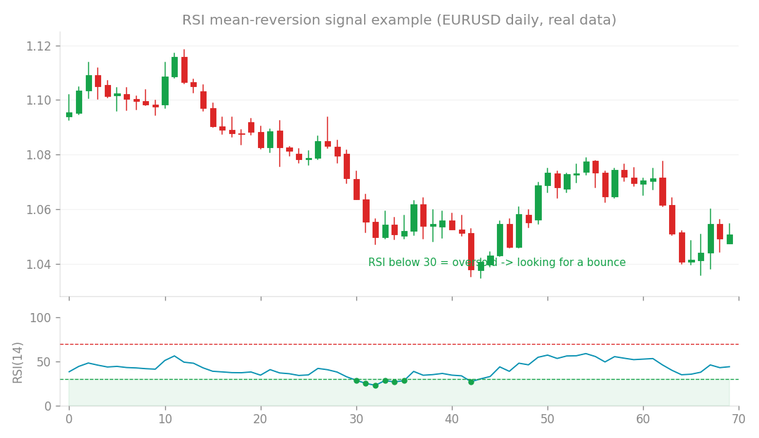
Mean-reversion (RSI) signal example (EURUSD daily, real data): look for a bounce when RSI is oversold.
What’s the idea?
You know the “Golden Cross,” right? It’s a classic bullish signal in technical analysis, where a shorter-term moving average (like the 50-day Simple Moving Average, or SMA) crosses above a longer-term one (like the 200-day SMA). It’s often seen as a sign that an upward trend is starting or strengthening. We also looked for an additional confirmation: an upward shift in the market’s “Dow structure,” which basically means higher highs and higher lows, reinforcing the bullish momentum.
Now, most traders would see these combined signals and think, “Time to buy!” But what if that obvious bullish signal is actually a trap? What if all the smart money has already priced it in, or even worse, it’s a “bull trap” designed to sucker in late buyers before the market reverses? This is what we call a “contrarian” hypothesis – betting against the crowd.
So, for this experiment, we mechanized a strategy called GoldenCrossFade. The idea was simple: when we saw both a Golden Cross and a confirmed upward shift in Dow structure, we’d take a short position, betting that the market would fall. We wanted to see if fading (betting against) this seemingly strong bullish signal actually had an edge. For comparison, we also tested a follow strategy, which would simply go long (buy) on the same signal, as most people would.
How I tested it
To give our contrarian hypothesis a fair shake, we didn’t just test one version. We ran multiple variations using different periods for the SMAs (e.g., 50/200, 20/100). This helps us see if the strategy is robust, meaning it works consistently across different settings. We used a rigorous testing method:
- In-Sample (IS) / Out-of-Sample (OOS) split: We train the strategy on one part of the historical data (IS) and then test it on completely unseen data (OOS). This prevents “curve fitting,” where a strategy looks great on past data but falls apart in the real world.
- Full Forward Testing: This is the ultimate test, simulating how the strategy would perform day-to-day as new data comes in. It’s the closest thing to live trading without actually risking real money.
To measure success, we focused on Profit Factor (PF). This is a super important metric:
gross profit / gross loss. A PF greater than 1 means the strategy is profitable before considering costs, while less than 1 means it’s losing money. We also looked at the actual percentage returns during the forward testing period.
What happened?
Alright, let’s get straight to the point: the GoldenCrossFade (our contrarian shorting strategy) showed no edge whatsoever. In fact, it was a consistent loser!
Across all the variations we tested during the forward testing period:
fade50/200(using 50- and 200-period SMAs) lost a significant -8.9% over months 1-6.- Even with a Take Profit (
+TP) modification, it still lost -1.1% over months 3-6. - Another variation,
fade20/100, performed even worse, losing a whopping -15.4% over months 1-6. You might be wondering about that+TPversion. It did show a tiny glimmer of hope in the In-Sample and Out-of-Sample tests, with PFs of 1.14 and 1.31 respectively. But “tiny” is the key word here – the actual profit was a minuscule +0.2% to +0.3%. As soon as we put it through full forward testing, that tiny edge completely vanished. This is a classic example of why robust forward testing is so crucial!
The surprising twist
Here’s where it gets interesting: while fading the signal was a bust, the same signal, when traded in the traditional direction (going long with follow20/100), actually showed a weak positive edge! It managed a +5.2% return over months 4-6, with decent PFs of 1.2-1.3 in both IS and OOS. However, it still didn’t hit our robustness targets over the full 6-month forward test period.
So, our initial hypothesis that “obvious bullish signals are a trap” turned out to be wrong. The signal wasn’t a trap; it was actually a (weak) genuine bullish indicator!
What I learned
This experiment gave us some really important takeaways, reinforcing lessons we’ve learned from previous research projects:
- Fighting a New Trend is Tough: Trying to “fade” a confirmed bullish reversal (a Golden Cross plus an upward Dow structure shift) means you’re betting against a new, emerging trend. You’re effectively facing a “double headwind” – the new upward momentum and the general upward drift of the market. It’s an uphill battle, and our results confirm you’ll likely lose.
- Contrarian Isn’t Always King: We’ve seen this before (in research projects ⑦, ⑧, ⑬): consistently finding a robust edge by simply betting against obvious market signals is incredibly difficult. The market often just keeps doing what it’s doing.
- Shorting is a Drag: Our research (projects ㉕, ㊸) has often shown that short positions tend to be harder to profit from compared to long positions. There are various reasons, including the inherent upward bias of many markets over time.
- Moving Averages are Lagging: Moving Average crosses (like the Golden Cross) are by nature lagging indicators. They confirm a trend after it’s already started. This makes them much better suited for trend-following strategies (like our
followstrategy, which showed a small profit) than for trying to pick reversals. (This aligns with our findings in projects ①, ②, ③).
The “Mirror Image” Trap: Gross vs. Net
This project highlighted a critical distinction: the difference between gross profit (what you’d make without any trading costs) and net profit (what you actually make after commissions, slippage, etc.).
- Without costs: If you look at the gross results (meaning, ignoring all trading costs), our
fadestrategy andfollowstrategy were almost perfect mirror images. Thefadehad a gross PF of 0.88, whilefollowhad a gross PF of 1.11. This means the underlying signal wasn’t just noise; it actually had a weak bullish bias. If we had zero costs, reversing the losingfadestrategy would have been profitable! - With costs: But here’s the kicker: trading costs eat into profits in both directions! They gnawed away at returns, turning gross profits into net losses of -0.6% to -2.5% across the board. This leads us to a crucial principle: *You can only reverse a losing strategy into a winning one if its losses come from a genuine inverse edge (meaning, the signal is consistently wrong). If a strategy loses due to trading costs, simply reversing it will still lose due to costs! To actually make a net profit, your gross edge needs to be more than double your trading costs. For example:
- The
fade50/200strategy had a tiny gross edge of +0.7% (if you flipped it from a loss to a win). But after costs, this became a net +0.1% – effectively zero. Not enough to overcome costs. - The
follow20/100strategy, on the other hand, had a stronger gross edge of +8.8%, which translated to a net +6.3% after costs. This shows it could have been profitable if robust.
Final Word
The GoldenCrossFade strategy, while a fascinating contrarian idea, ultimately failed. It didn’t have an edge, and trying to bet against confirmed bullish momentum was a losing battle. This project serves as a valuable record, confirming our long-held understanding that robust edges are rarely found by simply reversing obvious signals, especially when transaction costs are factored in. This strategy will remain in our archives as a permanent asset, a clear lesson learned about the pitfalls of contrarian trading against a confirmed trend.
How this connects
This verification builds on earlier ones (what failed before and what I tried this time, comparisons between approaches).