Core System Hit Its Ceiling? Why Index Diversification Failed!
## What's the idea?
A beginner-friendly summary of the verification: “Core System Hit Its Ceiling? Why Index Diversification Failed!”.
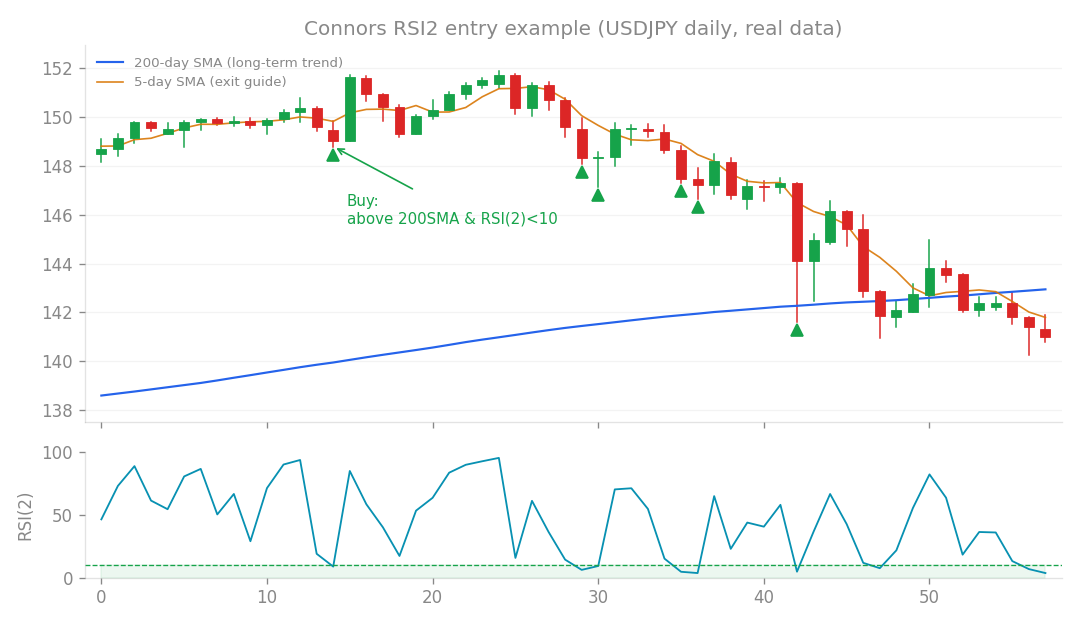
Connors RSI2 entry example (USDJPY daily, real data): buy the dip when price is above the 200-day SMA and RSI(2) falls below 10.
What’s the idea?
Here at the blog, we’re always trying to make our algorithmic FX trading systems (Expert Advisors, or EAs) even better. Our current star performer, v1.2.0, has been doing great, but we suspected there might be a way to squeeze out even more monthly profit. One part of v1.2.0, which we call the “index sleeve,” is specifically designed to trade stock indices. Think of an EA as having different “sleeves” or modules, each specializing in a certain type of trade. Our index sleeve currently focuses only on US indices (like the S&P 500, Nasdaq 100, and Dow Jones Industrial Average – US500, US100, US30). These three US indices are pretty tightly linked, showing a high correlation of 0.76. In other words, they tend to move up and down together quite a bit. The big question we wanted to answer was: Could we improve our monthly profit by diversifying this index sleeve geographically? We thought, “What if we add indices from other regions like Germany (DE40), Japan (JP225), and the UK (UK100)?” The idea was that by trading indices from different parts of the world, they wouldn’t all move in lockstep, potentially lowering overall risk and boosting returns. We also planned to re-optimize how we allocated our trading budget across all these different “sleeves.”
How I tested it
First things first, we needed a solid baseline. We meticulously broke down our v1.2.0 system to confirm its exact performance. This “re-validation” showed a total profit of +152.7%, with a maximum drawdown (DD) of just -10.0%, and a Profit Factor (PF) of 1.45.
- Drawdown (DD): This is the largest peak-to-trough decline in your trading account over a specific period. A -10.0% DD means the account balance dropped by no more than 10% from its highest point before recovering.
- Profit Factor (PF): This is simply your gross profit divided by your gross loss. A PF of 1.45 means for every $1 you lost, you made $1.45. Generally, a PF greater than 1 means the system is profitable. This baseline check confirmed that our testing environment was perfectly replicating the real system, so we were good to go! Then, we combined the results of all the different index strategies as if they were trading together in one big, shared account, giving us a true picture of their combined performance.
What happened?
We had some surprising, and frankly, counter-intuitive results!
The Real Culprit for Drawdown
Our first big discovery came from analyzing the “correlation matrix” – basically, a fancy table showing how much different parts of our EA system move together. We found that the main source of our system-wide drawdown wasn’t the index sleeve at all! Instead, the biggest bottleneck was a significant correlation of 0.54 between our “core” system (the main engine) and another sleeve called “sat2.” This sat2 sleeve, as we’ve explored in past research (like #73-74), is highly focused on refining trend-following executions, so it naturally moves quite similarly to the core engine. Think of it like trying to fix a leaky faucet in your kitchen, only to discover the real leak is actually in your basement pipes! Meanwhile, our existing index sleeve (which had a low correlation of 0.10 with the core), along with other strategies like Connors (-0.01 correlation) and Calendar (0.28 correlation), were already “good students.” They were already largely uncorrelated with the core system, meaning they didn’t contribute significantly to the overall system’s drawdown. This immediately told us: the index sleeve wasn’t the problem we thought it was! We also noticed something interesting about the Japanese index (JP225) – it showed a very low correlation (0.10-0.13) with the US indices. This made it seem like a “treasure” for diversification within the index group itself. But as you’ll see, that wasn’t enough to save the day.
Geographic Diversification: A Step Backward!
Despite the JP225’s low correlation, our grand plan for geographic diversification actually backfired! It turns out, our original US3 indices (US500/US100/US30) were simply exceptionally high quality on their own. They boasted an incredible Profit Factor (PF) of 5.38 and a Sharpe Ratio of 0.87.
- Sharpe Ratio: A measure of risk-adjusted return. It tells you how much return you get for the risk you take. A higher Sharpe Ratio is better. In contrast, the non-US indices we added (DE40/JP225/UK100) were individually much lower quality. When we combined them all into a “World 6” portfolio, the benefit of lower correlation (which did drop from 0.76 down to 0.34) was completely outweighed by the loss of overall quality. It was like adding several weaker players to an already championship-winning team – the team as a whole actually got worse, even if they looked “more diverse” on paper. The overall PF for the World 6 group plummeted to 2.27. Let’s look at the numbers for monthly profit, normalized to a 10% drawdown (meaning we adjusted the risk level so all strategies had the same maximum drawdown):
- US3 indices alone: A robust +1.16% monthly profit.
- US3 + JP225 (selective diversification): Dropped to +1.07%. Even with aggressive risk optimization, it only reached +1.08%.
- World 6 (all indices): Fell further to +0.92%.
- World 6 + Connors (another strategy): The lowest at +0.87%. Our Monte Carlo (MC) simulations, which are like running thousands of hypothetical scenarios to test robustness, also showed a decline. The reliability of the system dropped from 92% (with just US3) down to 88% (with World 6).
Budget Re-optimization Hits a Wall
We also tried re-optimizing our budget allocation across all the different sleeves, hoping to find a magic combination. But every single candidate we tested resulted in monthly profits between +0.87% and +0.92% (at 10% DD). They all seemed to stick to what we call the “Calmar ceiling” of around 1.1.
- Calmar Ratio: Similar to the Sharpe Ratio, but it uses maximum drawdown instead of standard deviation for risk. A higher Calmar Ratio indicates better risk-adjusted returns. Crucially, none of these re-optimized allocations managed to surpass the +1.16% monthly profit of our original v1.2.0 system with just the US3 indices.
What I learned
This research, though it didn’t give us the profit boost we hoped for, delivered some incredibly valuable lessons and re-confirmed some prior findings. First, we re-learned a lesson from Research #51: Since the index sleeve wasn’t the bottleneck for our system’s drawdown, trying to “improve” it through geographic diversification was a mistake. We simply added lower-quality components, which, as we saw, ended up hurting our overall performance rather than helping. Second, and most importantly, our v1.2.0 system is truly operating at what we call the “diversification frontier’s ceiling.” This means that, given the components it currently uses, it’s already optimally diversified. We can’t simply add more of the same type of thing (like more indices) and expect a meaningful improvement. We’ve hit the limit of what this specific approach can deliver. The only remaining “lever” we have to significantly push monthly profit higher is to reduce that stubborn 0.54 correlation between our “core” system and the “sat2” sleeve. This would require finding genuinely uncorrelated sources of positive expected value (EV).
- Expected Value (EV): The average outcome you can expect from a trade if you repeat it many times. Positive EV means you expect to profit over the long run. However, as our previous research (like #34) has consistently concluded, such truly uncorrelated positive EV sources often come from “external data” – things like carry trades (profiting from interest rate differentials) or other non-price factors. These are typically not accessible to a standard “prop EA,” which relies solely on price data. So, within the safe and practical confines of using only price data, our v1.2.0 system (which delivers around 0.68% compounded monthly profit with a -10% drawdown and 92% Monte Carlo reliability) is confirmed to be the absolute best we can do right now. The conclusion is clear: No changes to the confirmed system are needed. Our initial decision to use only the US3 indices for the index sleeve was correct. The non-US indices will not be adopted. Sometimes, the best course of action is to stick with what’s already working incredibly well!
How this connects
This verification builds on earlier ones (what failed before and what I tried this time, comparisons between approaches).